Client / Superunie
Project / Cafe Nova
Category / Packaging design

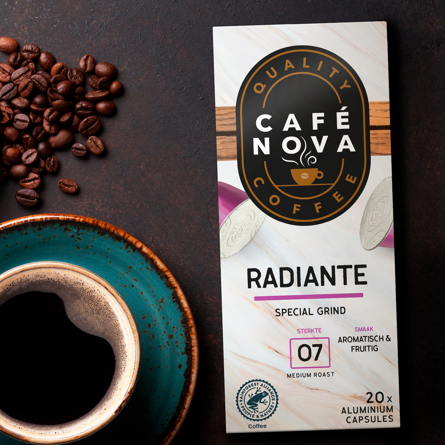
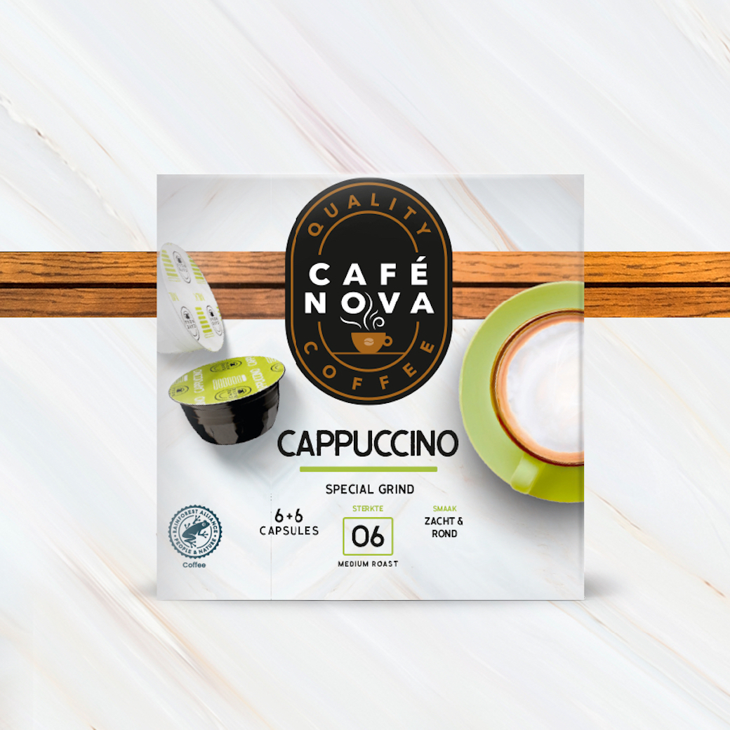
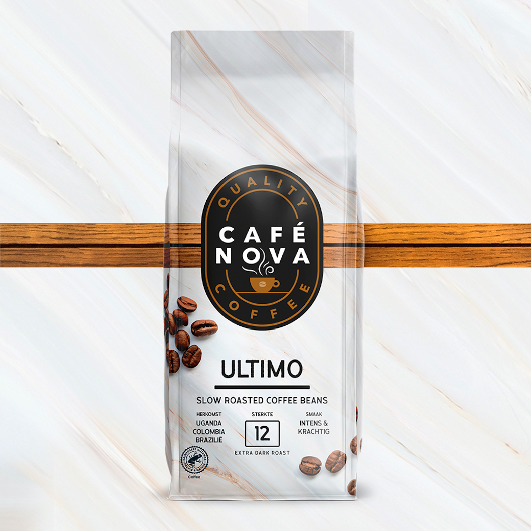
Superunie has added four new brands to its own brand portfolio. The positioning of these brands was clear: excellent quality products for an affordable price. Because consumers increasingly need this. Café Nova is the new brand for coffee beans and coffee cups. The coffee is roasted slowly with craftsmanship and love. This slow roasting process ensures that the beans can fully develop their aroma. With blends from sweet and complex to powerful and intense. To enjoy a delicious cup of coffee at home, just like it is served at the best coffee bar.

The various brands use a lot of black on the coffee shelves. This is a commonly seen colour code for luxury coffees. We wanted to create something different for this brand. A little softer than the hard black you see in the world of coffee. Something that also goes well with the excellent flavours of this coffee. This is how we came up with the concept of Café Nova with the feel of an Italian coffee bar. The design shows this through the beautiful warm marble background in combination with the wooden beam. The black oval shape with the name inside creates a strong and clearly visible logo that radiates quality. All this combined ensures a good impact on the shelf in the store.
