Client / Superunie
Project / First Choice
Category / Packaging Design

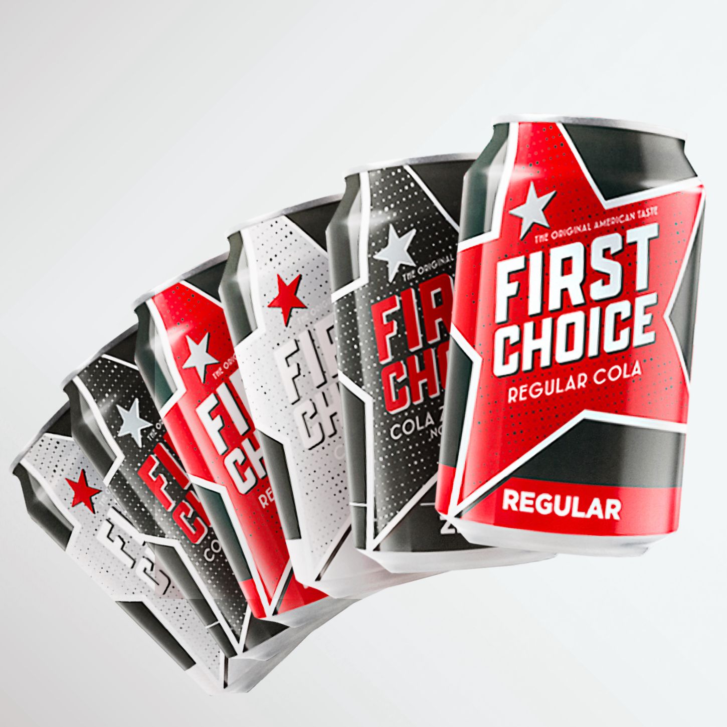
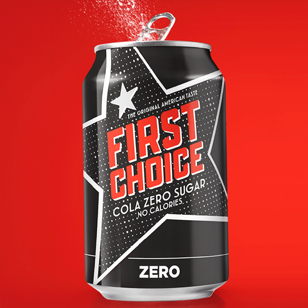
A-brands are usually good, but they also often charge a high price. Because products ar often the reference for taste. But what if blind taste tests show that there’s a comparable alternative that is considerably cheaper? Behold First Choice Cola from SuperUnie. Refreshingly delicious, without calories and sugar! Enjoy not only the best price, but also the great flavour and the bubbles. That's why they say: “First Choice Cola is surprisingly tasty for next to nothing!”

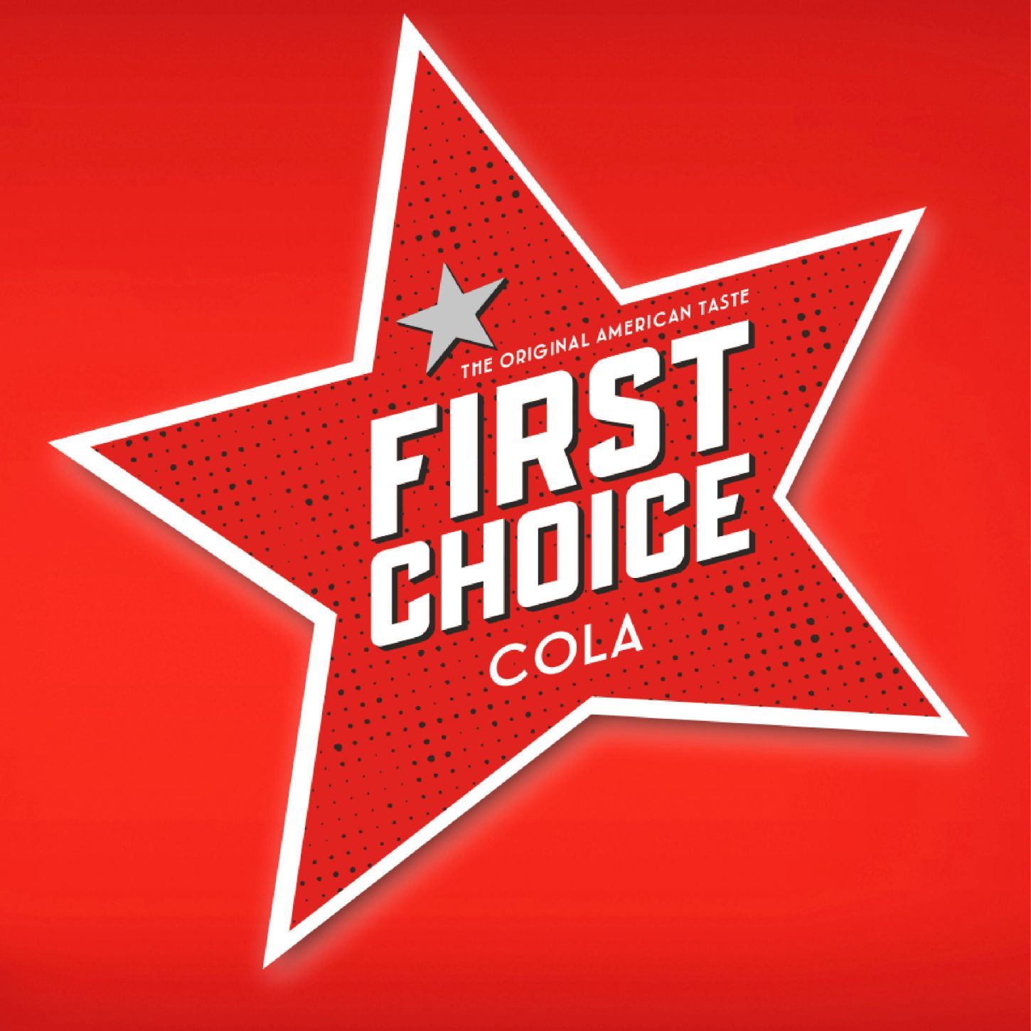
Physical shelf was really the starting point for us. How can we stand out powerfully and be easily recognisable? And there the oblique effect of the word mark and the underlying star proved to be a perfect solution. In addition to the general colour coding for flavours, we have created a graphic pattern that further emphasises the stimulating properties of the product and brand.
