Client / Superunie
Project / Sou Sou
Category / Packaging Design

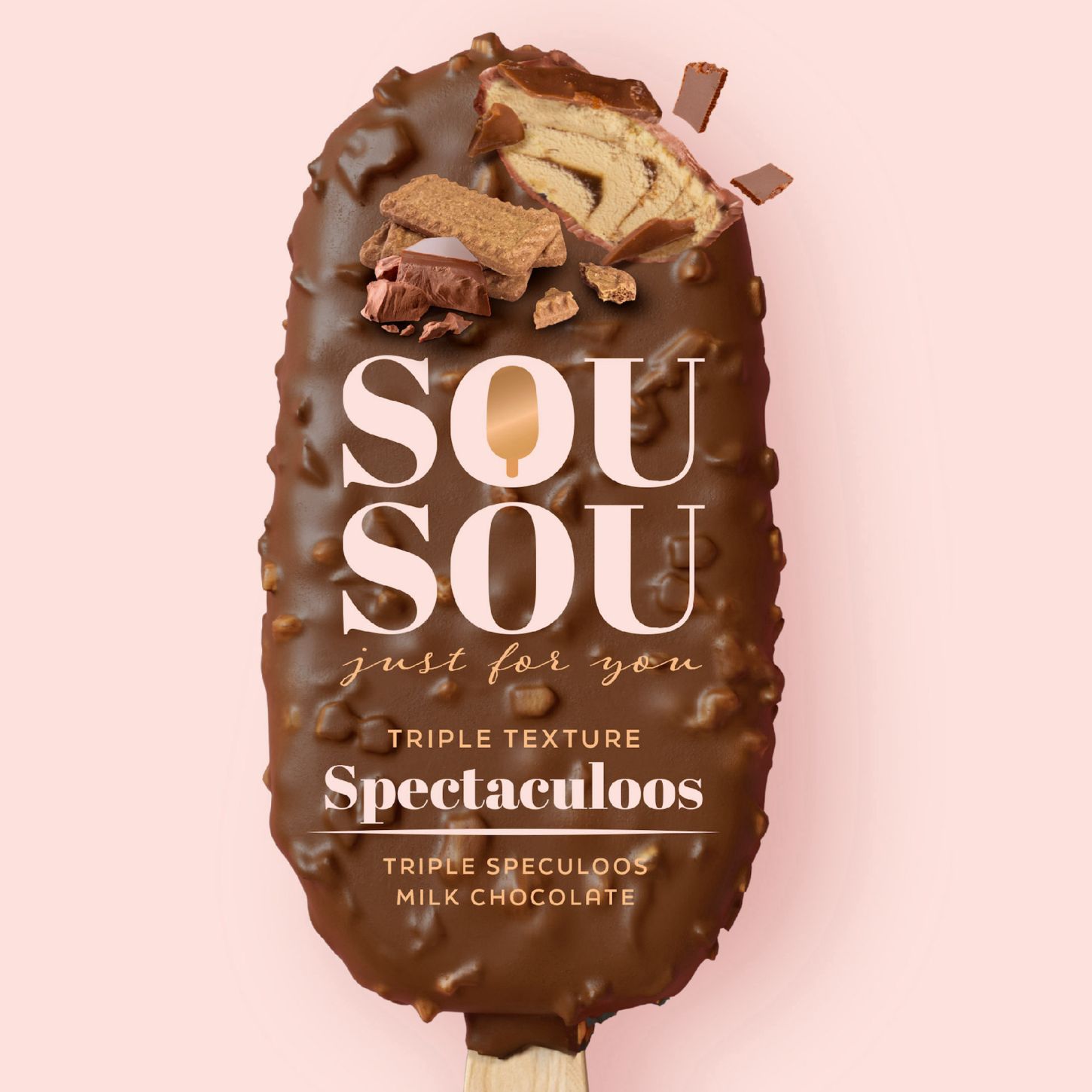
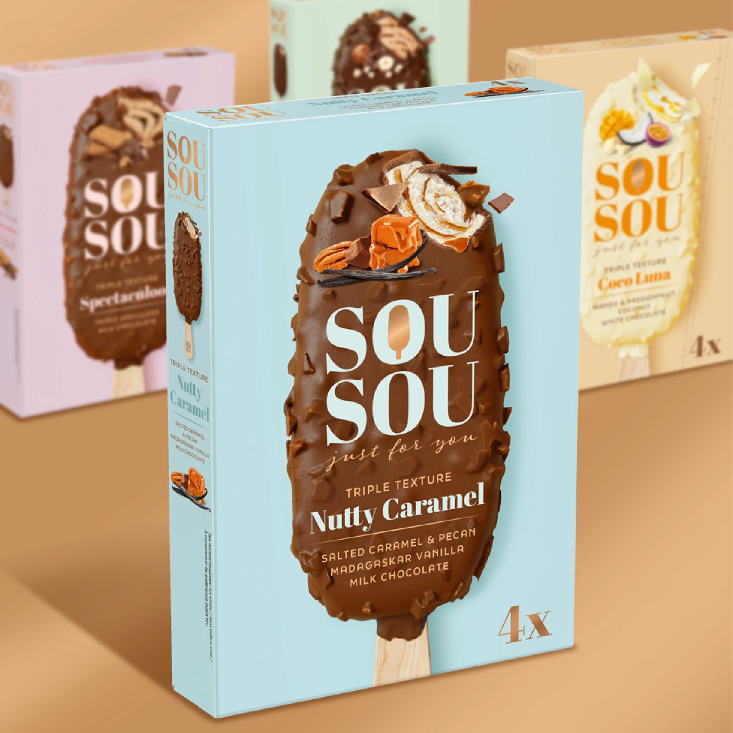
Superunie has added four new brands to its own brand portfolio. The positioning of these brands was clear: excellent quality products for an affordable price. Because consumers increasingly need this. SOU SOU is a triple texture ice cream treat with three layers full of flavour. The first layer is a firm layer of the tastiest chocolate with a crunchy twist. Layer two is the creamiest ice cream for a silky-smooth feel on your tongue and layer three is a rich swirl with surprising flavour.

After several brainstorming sessions and concepts, SOU SOU, just for you, was created. Based on the word Bisou (French for kiss). SOU SOU is delicious ice cream with different textures to enjoy. This is reinforced in the design by the beautiful photography that clearly shows the different layers. We used the enlarged ice cream as a holder for all the information and the loose ingredients. The pastel colours in the background make the ice cream stand out in the packaging. Combined with the gold accents, this creates extreme indulgence and makes for a sophisticated range. Pastel colours are rarely used on ice cream shelves, which is why this design stands out on the shelf.
