DF_NH_WEB-Startheading_LL.svg

Client / Pladis
Project / Brand portfolio
Category / Packaging design
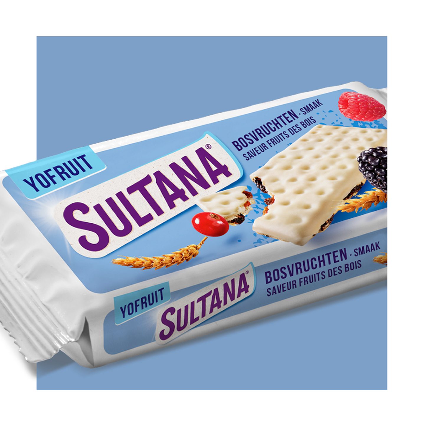
When Dutch immigrants in Indonesia ask for a snack, Mr Verkade comes up with an idea. He adds the sweet, brown raisins made from the white Sultana grapes native to Greece and Turkey to cereal biscuits. Because the moisture in raisins keeps the biscuits fresh even longer. Ideal for surviving a long boat trip. Or a bumpy bike ride to work. A brand is born. And so is the first Sultana FruitBiscuit Naturel.

DF_NH_WEB-Case_Sultana_v1_2.jpg
DF_NH_WEB-Case_Sultana_v1_4.jpg

Sultana has now grown into a strong Dutch brand with various products. It now offers a lot of on-the-go, responsible snacks. For example, there are yoghurt-flavoured snacks. Snacks for a hearty craving. Even snacks without raisins, extra crunchy!
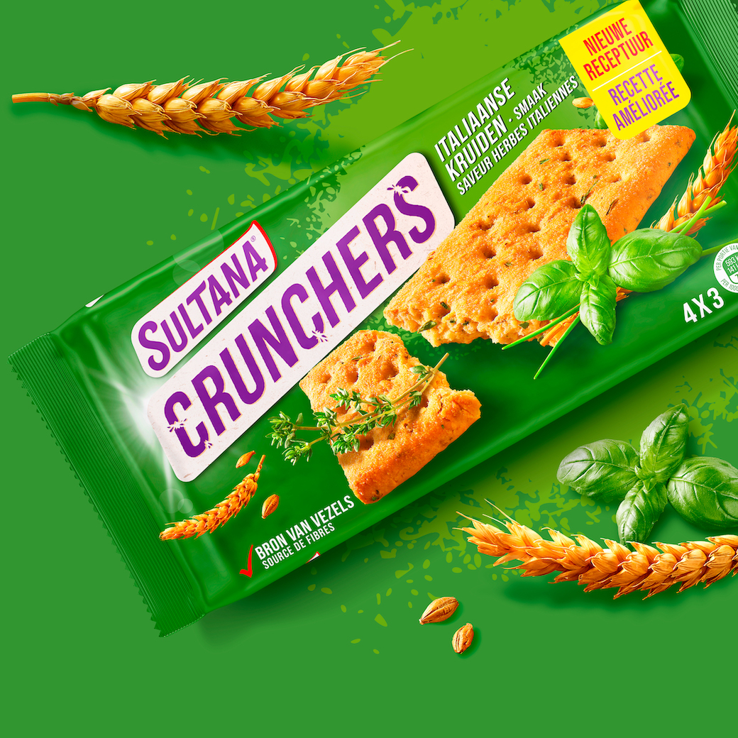
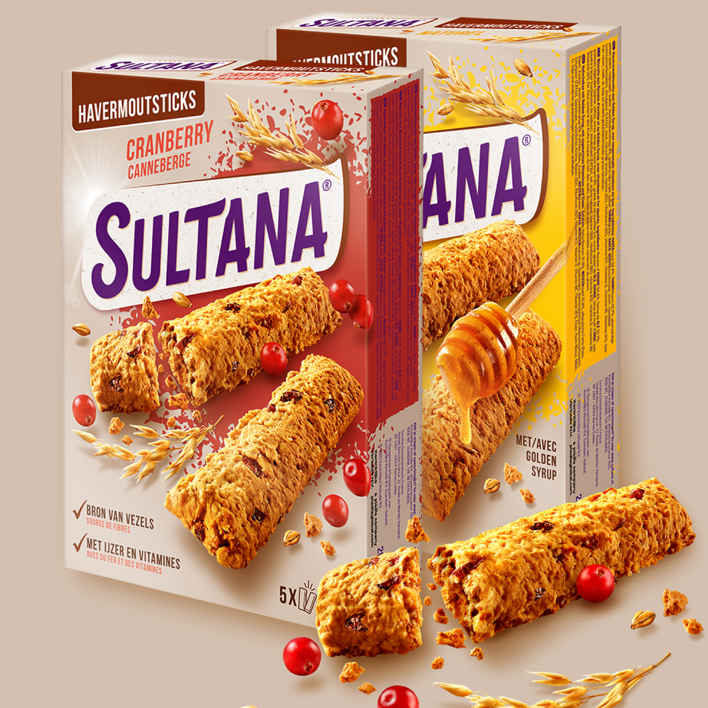
The wish was to give Sultana a more extroverted and active outdoor feeling with more intensity of the products in a more modern guise. Initially, we did this by making the logo more active, powerful and modern. In addition, we looked for a colour palette that radiates more power. We have also made strides in more natural structures and photography that do more justice to the product and ingredient.

DF_NH_WEB-Case_Sultana_v1_5.jpg