DF_NH_WEB-Case_Verkade_LL.svg

Client / Pladis
Project / Brand portfolio
Category / Packaging design

Mountain works a lot for well-known Dutch brands and Verkade is of course a good example of this. Since 1886, Verkade has been serving people coffee and tea with the most delicious biscuits and chocolate. To enjoy a moment of unbridled Dutch cosiness. With the familiar flavours that you used to enjoy, but nowadays also with new products with surprising flavour combinations. Verkade is a true expert in the field of biscuits and chocolate and has been voted Brand of the Year three times for good reason.

DF_NH_WEB-Case_Verkade_v1_2.jpg
DF_NH_WEB-Case_Verkade_v1_3.jpg

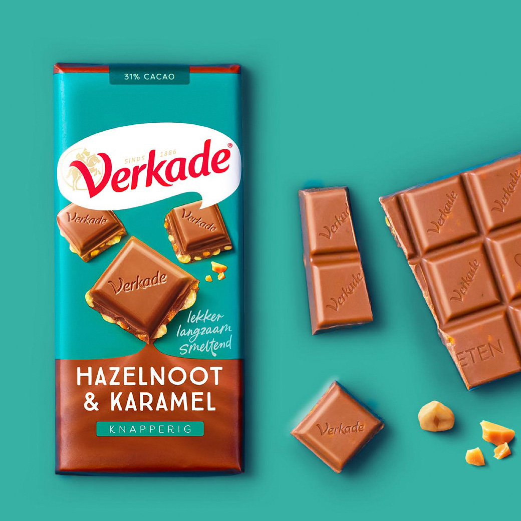
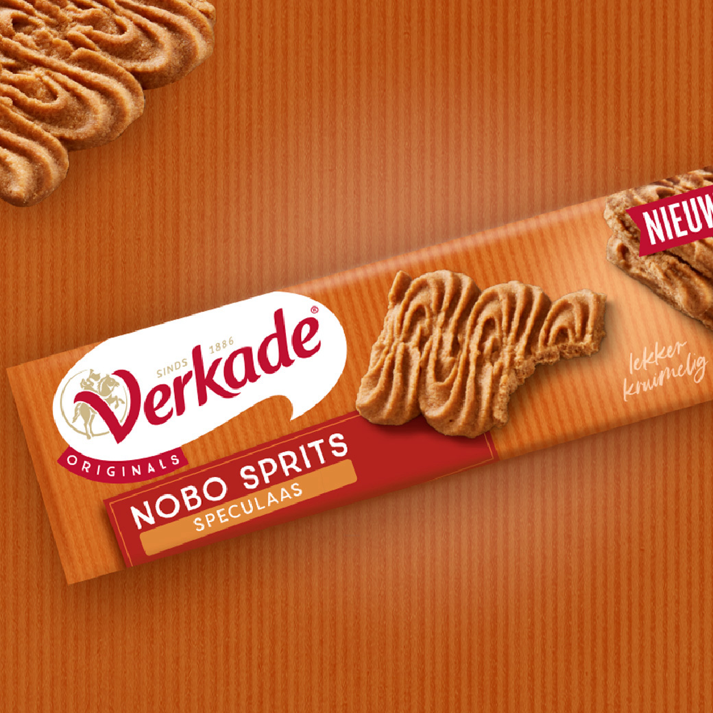
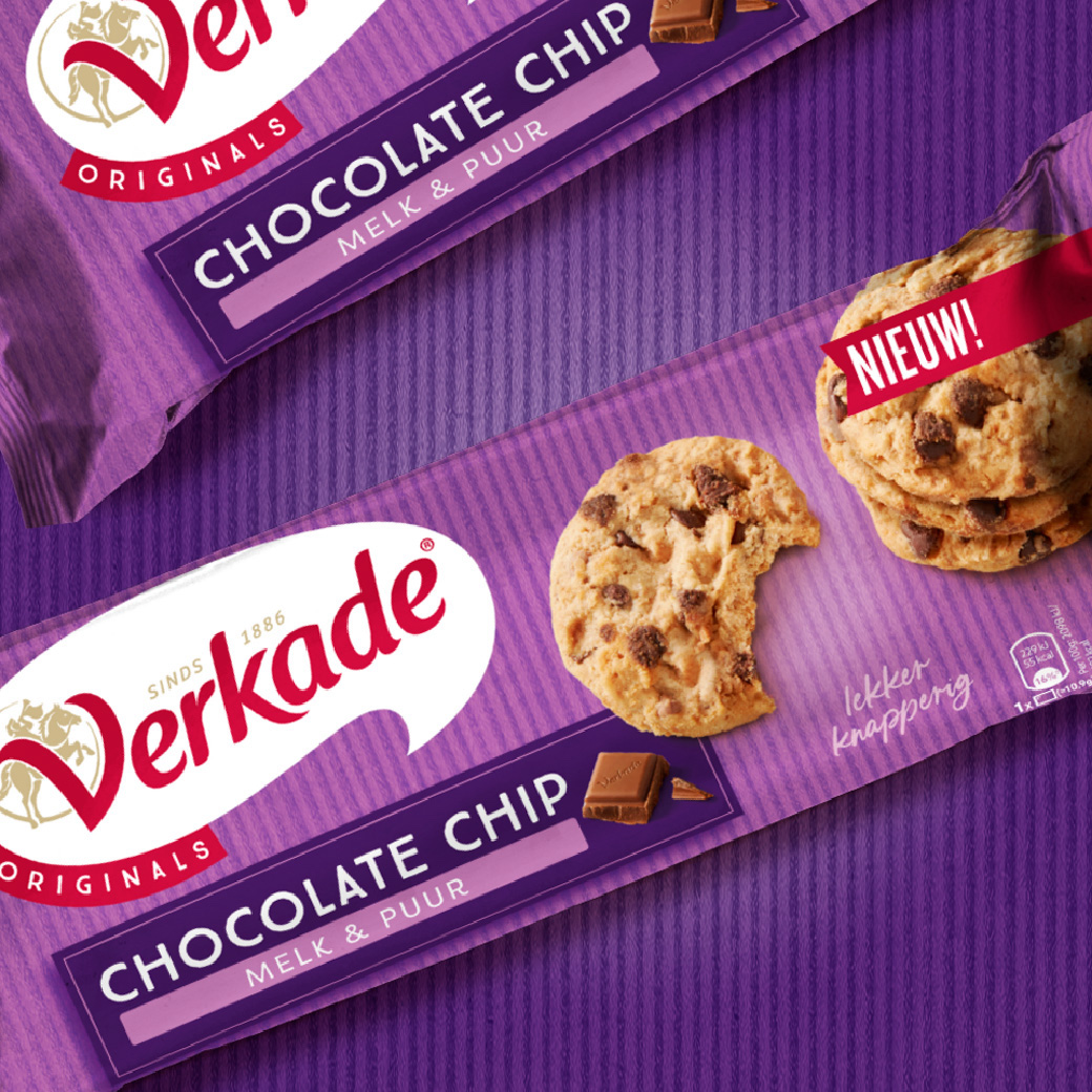
Apart from the well-known product types, Verkade has been all about Deliciously Real since 1886. As part of a larger rebranding and communications campaign, we were allowed to sink our teeth into the visual identity and packaging design of Verkade. It's a bit of a puzzle because on the one hand, we wanted to visually strengthen the brand and on the other, we wanted to offer sufficient space in various Verkade categories to be able to be effectively on the shelf.

The design focuses on the renewed word and image mark in a speech bubble/swirl. From there, we looked for design elements in the categories of biscuits, savoury, chocolate and Sinterklaas that would strengthen the overall brand on the one hand and optimally communicate the product features on the other.

DF_NH_WEB-Case_Verkade_v1-4.jpg